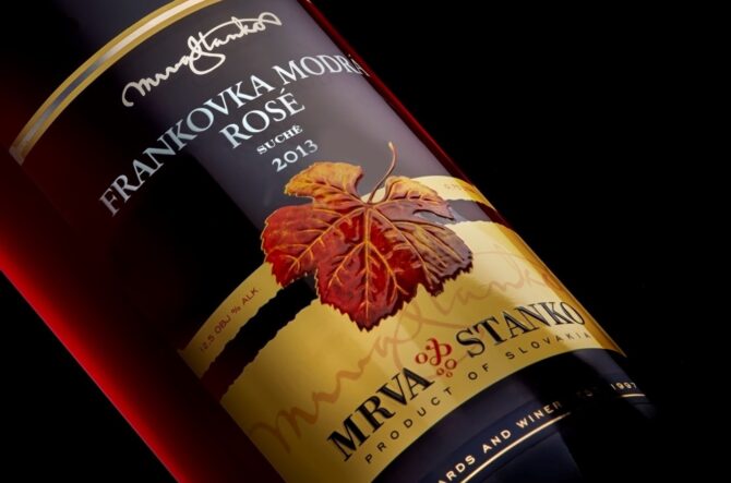
Winery Mrva & Stanko is a well-known Slovak wine producer. Their portfolio is mostly visible in bottles with no-label-look labels seemingly decorating the bottle with a colourful wine-leaf. We enjoy printing these UV flexo and UV screen printing beauties with special varnishing finish for years already. The winery tried paper-based labels for some of their portfolio already. They were not satisfied, until now.
1. Start with a small edition
Printing „in bulk“ is always a favourable option with traditional printing techniques. You can print similar labels together and optimize the production and prices. Nevertheless, when innovating for a brand-new design, it’s safer to start with a small edition you can tune for an ideal outcome first. As Mr. Stanko put it:
P. S.: “We divided grape varieties to separate the Burgundy wine types. They needed new type of a suitable bottle and along that a new label design in a different shape from other ones in our portfolio. We have been trying paper-based labels for some time already, but until now we didn’t like the changes coming with that. We just weren’t satisfied. Now this impulse made us look for a better solution.”
Thanks to years of cooperation with Purgina, Mr. Stanko and Mr. Mrva knew, its‘ best to discuss new design with us and their graphic designer studio first, before placing an order. They came with a clear idea about message on their new label and the approximate design alternatives.
2. Suitable base material is essential
Paper labels on wine bottles are the most common solution. Influenced by environment where the bottle is stored and used, paper can change it’s appearance. Mr. Mrva and Mr. Stanko would not want that on their products and were searching for a better solution. Finally, they choose a new type of base material called “Fibers look”. This is a mix of synthetic materials and cellulose that gives an interesting structure with the look of a hand-made paper.
The basis for success was a varied sample book from our material suppliers we searched through together. Knowing their requirements and technical qualities of the innovative new materials, we could match their preferences during our meeting easily.
P.S.: “White cotton” base material was our favourite at first. Nevertheless, after years of working with that we were struggling with its reactions to changes of temperature and humidity – for example when taking the bottles from fridge and such. The paper would crumple. We really didn’t like that with our top-of-the-range products. This new material seems perfect so far.
Š.J.: “We knew we want “art paper” and Purgina really delivered on the variety of samples here…“
3. Combining the right print technologies can maximize the effect
Š.J.: “Our goal was continuity with the overall product range of wines by Mrva & Stanko. The wine leaf is their signature mark. We knew it will be incorporated. Question was how – maybe in different graphic design popping up, or in background; or whether it will become interesting in some print technique we choose – those were points of discussion between us, client and Purgina.“
Every graphic design studio has an overview of print technologies they can use for your label design. How they use them for combining the patterns and messages on your product, depends on their creativity. Then of course, we are happy to support even the most daring combinations of print technologies – especially if we are invited for finish of the design and can help with combinations that bring the best out of the ideas.
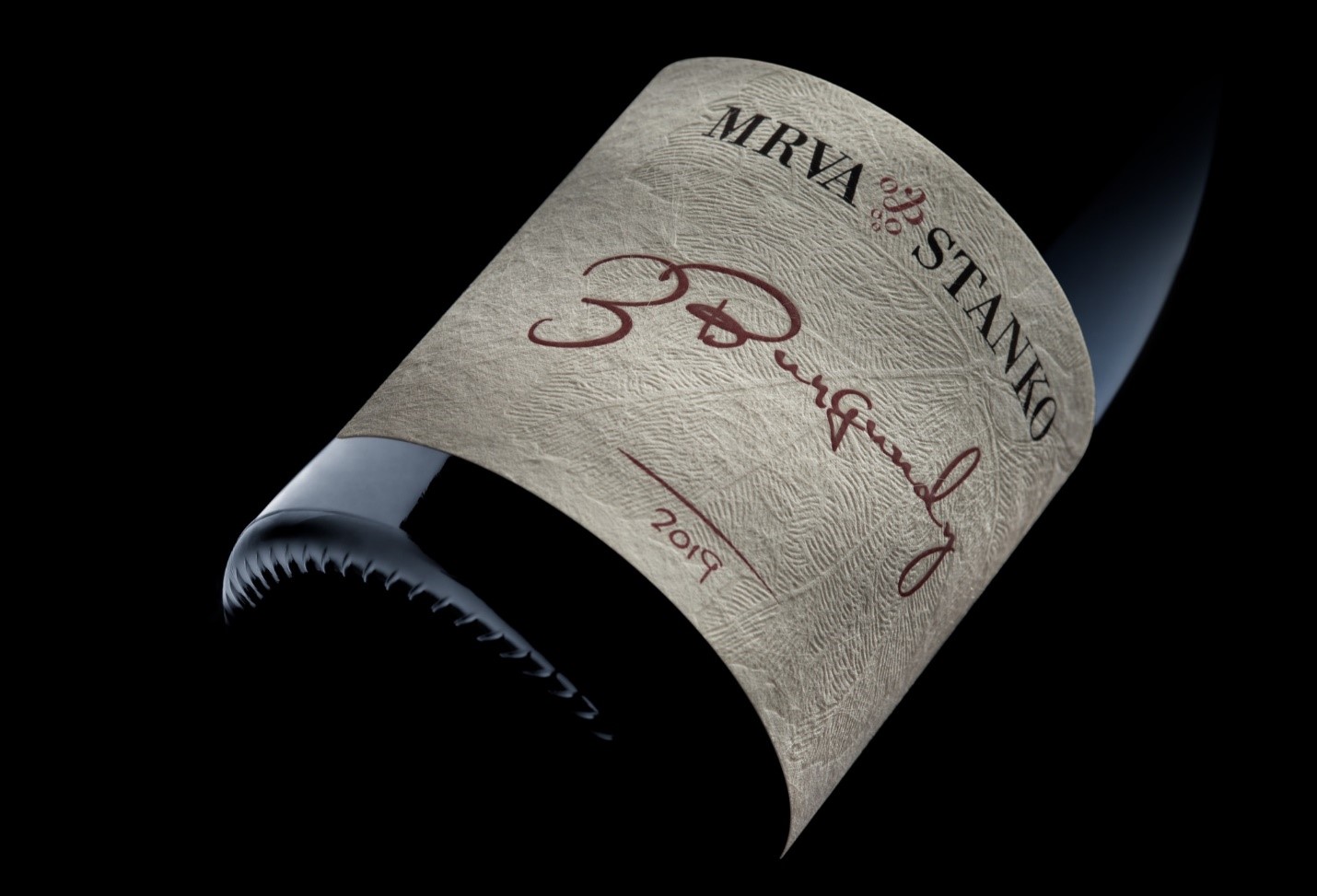
In this case we agreed on combination with debossing – pressing the structure of paper for structural effect, accompanied with black-foil stamping in logo and varnishing for relief painting of the wine variety text. As an outcome, the label has a very decently combined, yet demanding finishing for a multi-level perspective.
Š.J.: “Our creative thinking was around Burgundy wine with its specific bottle, as well as the specific wine product. We wanted the wine makers’ signature to be present too. Such design shall be natural, not some golden stamping or similar. We were looking in to having the paper stand out rather in some way. Debossing of the leaf motive came as a great solution. Along that, we used typography in hand-written style on part of the text design, to resemble hand-written markups by wine maker typically used with these wines.“
3 Burgundy label became a “pilot“ for the new design lane of labels. The new paper-based solution and printing technologies combination showed the possibilities in reality and offered space for further creativity in design, as well as optimalization in production.
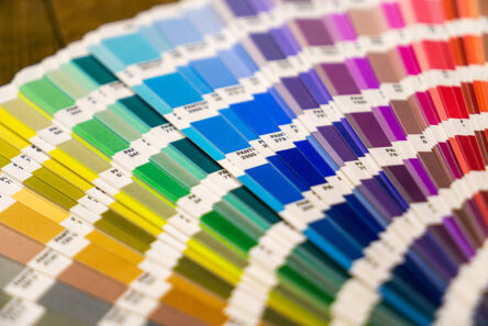
Š.J.: “Samples of printing technologies were discussed directly with Ms. Palčákova (Purgina sales representative). We even fine-tuned the Pantone matched colour that we didn’t really like after the first print. As an outcome all clicked perfectly for the visual design. My only worry was the practical user experience with the rough paper label on wine bottles. How well will it work for the wine makers? I had to call them and get confirmation, that this really worked well on the bottles.“
4. Do consider the practical use of the labels
However pretty and technologically perfectly printed label can become a negatively perceived detail on your product, if it’s used in a wrong way. In this case the wine makers did consider the paper material and printing stability. On top of that they had to test the labels during the mass labelling and afterwards in distribution. You don’t want to have labels that slow down your production process, or get damaged in an unsuitable combination of material designs (for example by using cardboard boxes that damage the bottle during transport due to abrasion). And lastly, they asked their customers for feedback as well.
P.S.: “It works! None of our colleagues would complain during any part of the production or distribution. I was worried a bit, seeing the thickness of that paper. Will it cause trouble? So far, I can only say it is much better solution to anything we have tried before… I did get one reaction of “I don’t like this” comment from a client. But 99% feedback is positive and we are just thinking about the transition to this new combination for the rest of our top-of-the-range wines. First thing people perceive is the visual of the wine. We want them to recognize our ranges of wine with this design soon. We will follow up on our discussions with Purgina too. We want to be sure we align the production of our labels optimally.“
After all the practical considerations in the label production and use, do not forget about the marketing communication opportunities. It’s not always the right time to base your campaign on the brand-new design, if it’s still covering just part of your portfolio. Phase the transition and capture the market attention wisely.
Š.J.: “So far we didn’t launch a campaign. Not only was it the “Covid year“ when everything was in lockdown. On top of that this series is a small one. We would like to launch a complex campaign with the other wines in the new visual design. It will be designed very differently from the look & feel we use now, working with the no-label-look bottles.“
We are grateful for another inspirational cooperation, and the follow up interview! Hoping these notes will help our other clients with their projects, we are looking forward to hear your plans too.
* Cuvée 3 Burgundy wine consists of three Burgundy wine varieties and is suitable for archiving. The archiving time and its conditions can expose the label on the bottle to humidity, as well as abrasion, temperature changes and the like.