Older posts
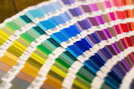
Matching colours for your label are our pride
Salmon – coral – peach may be code words for colours not everyone understands. And that’s not a problem with us either. Our colleagues take your orders for accurate colour shade very seriously and hold the Pantone matching system accountable for the match instead of often confusing word plays and lofty referrals. To provide printing services with consistent colour outcome is a bit of “science“ though. Especially with changes in base materials and print techniques. How come?
What you should know when labeling by hand
Self-adhesive labels on rolls are primarily intended for application by machine. However, if you want to label your products by hand, here are some advices on how to avoid usual problems.